For this assignment, I took pictures of store windows that exemplified an aspect of visual merchandising.
1. Draw traffic to the store.
This is the shoe store Russell Bromley.

I thought it drew traffic into the store because it has tons of shoes displayed in the windows so viewers can see so much of what they have to offer. The shoes are displayed in an interesting way. They're still very much organized but they're in various places on the floor in different formations. The windows are very open and allow a viewer to see into the rest of the store, which I also think draws traffic in. A viewer might see something in the back of the store he or she wants to go look at.
This is Aldo, a shoe store.

You may not be able to see too well in this picture but the tables at the very front of the store are filled to the max with shoes. They are in neat rows but you couldn't fit another shoe on these tables if you tried. I think placing so many shoes at the very front draws traffic in because viewers can see so much merchandise and chances are - with that many pairs of shoes, someone will see something they like. There are also big sale signs, which everyone loves.
2. Promote specific lines, collections, or events.
This is Thornton's - the Art of the Chocolatier.


It's a chocolate shop but you would never know it from looking at the window display. They are celebrating the Diamond Jubilee like most of the other stores were at the beginning of June. However, I thought this was unique and interesting because you couldn't really tell what they were selling inside from looking at the window. The most recognizable relatable image is the boy and the birthday cake on the left.
3. Attract a specific target market.
This is a picture of Accessorize.

They have a beach theme with pictures of teenage girls having fun in the sun with all of their accessories - sunglasses, hats, beach bag, flip flops, bathing suits, etc. I thought this window display attracted the specific target market of teen or tween girls because the store caters to them.
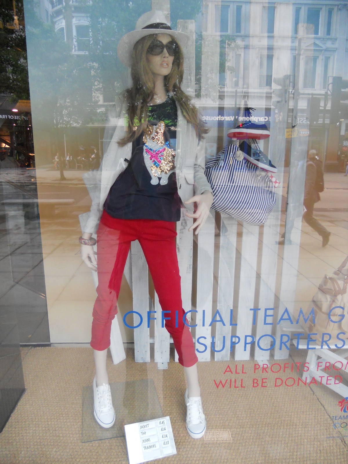
4. Educate the consumer about price accessories, etc.
This is the store Jane Norman.


They educate the consumer about their prices by displaying some of them very clear on their windows. It's in big font, a bold color, and easy to read.
This is a store window of Next.
They have tons of accessories displayed on mannequins in their store windows. They have hats, sunglasses, bracelets, bags, belts, etc. They also have the prices of each piece of the outfit listed below the mannequin.
This is a store window of River Island.

They also display accessories and prices in their windows like Next does. However, I think they show even more accessories in their windows.
5. Spark curiosity.
This is a T-Mobile store window.

I think this window display sparks curiosity because it's very unique an it has nothing to do with phones. Their scene is a chaotic tea party with a bunch of animals. You wouldn't even know what this store was selling unless you looked up at the sign hanging above the table, which gives information about their phones and prices. Most phone stores have just phones in their store windows. This window sparked my curiosity because it was completely different.
6. Explore creativity and design opportunities.
This is a Zara store window.

I thought this window was very creative. The mannequins are all over the place and you have to look for a minute to see how they fit together. There is a tent behind them, they have badges, they're waiting in line, and they look like they are dressed for a music festival. However, to me, the most creative part about this window display is that all of the mannequins heads are covered in sprinkles.
This is a Top Shop store window.

This is my absolute favorite and I'm obsessed with it. I love how creative it is. The spiky, wild, pastel hair and flashy makeup adds so much to the overall effect. I like how they're all sitting on a birthday cake. The feathers, streamers, and balloons mean they must be at a big party. I love that their outfits are so unique and stand out. I like how the balloons continue throughout the store, which you can see in the back through the window.
7. Support store sales or other events.
This is a French Connection store window.


They still display some of their merchandise in the windows but you almost don't notice the mannequins because the sale signs are so big. I also like how they incorporate red, white, and blue patriotism into their sale signs.
This is a Foot Locker store window.

I thought it was interesting that they have a special cardboard structure made to act as a sign and display same items at the same time. I'm not sure how common this is but I haven't noticed it very much. I've seen mostly sale signs with mannequins or tables or some other structure to display merchandise that's on sale but I haven't noticed a sale sign that also displays the merchandise.
I think store design is something that plays key role in attracting new people to your store. good store display idea can play key part in increasing your product sales.
ReplyDeleteshop display
http://www.millsdisplay.com.au/